Whether you are a billion-dollar tech giant like Amazon or a small chocolate shop owner, if you have a landing page on your website, you need a great on-page call to action (CTA) in order to convert those online prospects into customers. A call to action is a headline, callout, button, phone number, form, or other action you’d like your customers to take on a page. If you’re collecting emails for a mailing list, the form asking people to input their email address is a CTA. If you’re an online retailer hoping to capitalize on Cyber Monday, your CTA may be a coupon code encouraging customers to buy something before a sale ends.
CTAs take many forms, but one thing remains constant – they are the single most important part of any landing page. A landing page is any page you are guiding traffic to that has a single, focused objective – for many small businesses, their home page is a de facto landing page.
Why are CTAs so important?
A clear CTA is vital to the success of a landing page. You have likely earned any traffic you see on your landing page through paid advertising or another promotion like an email list. However, if people who arrive at your landing page can’t figure out what they’re supposed to do on the page or if they find the page doesn’t address their question, you could lose a potential customer.
Think about it this way – a real estate agent pays for a bus stop advertisement talking all about their experience, knowledge, and professionalism, but forgets to put their phone number (a CTA) on the ad. Without a CTA, the advertisement’s main objective (new clients) is severely hampered. The same is true if the phone number is buried or hard to see – it may as well not even be there. While the bus advertisement may have raised awareness for our unfortunate agent, it is a lot of money wasted if no one actually calls.
What goes into a good CTA?
Visibility
First and foremost, people need to be able to see your CTA. You can get as detailed as you want here, delving into the psychology of how people read websites or which colors people respond to best. But there are two things to focus on: keep your CTA above the fold (the visible section above the bottom of the page at which you need to scroll to see more – like a newspaper fold) and don’t make people hunt for it. Netflix.com provides an excellent example of a highly visible
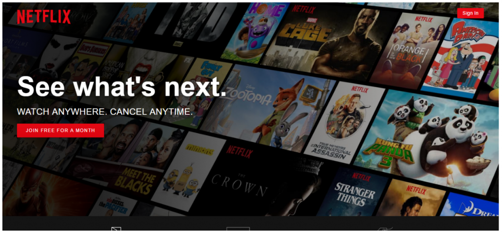
On this page, there is an obvious red button under large text that immediately draws your eye. Further, the text encourages even skeptical consumers by assuring them they can cancel at any time. As you can see, there are other things on the page if you scroll down, but the main thing the page wants you to do is join for a free month. Whether it’s a button or a form you want users to fill out, always ask yourself, “is my CTA obvious?”
Clarity
Going hand-in-hand with visibility is clarity. Just because people can see your CTA doesn’t mean it’s necessarily clear. Take for example the homepage for HomeSecuritySystems.net:
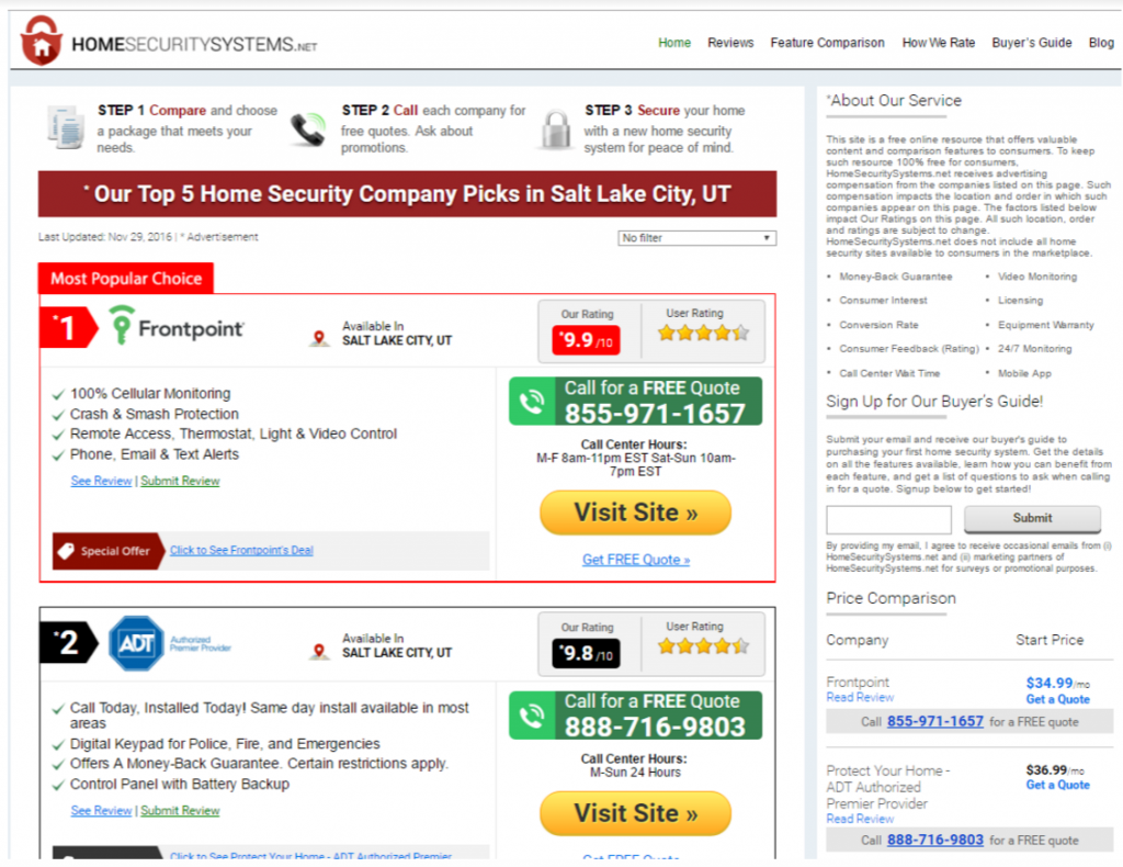
As the first paid result on Google for “home security systems,” this site is paying upwards of $50 every time someone clicks on their link from a Google result. However, as a conversion focused page, there is no clear call to action – there are dozens. There are options to visit sites, call numbers, do more research, sign up for a buyer’s guide, along with others.
On the other hand, this landing page from Vivint provides a much clearer CTA – they want you to call:

Even though there are two “call now” CTAs, they both point to the same phone number, making the page simpler, clearer, and more focused.
Compelling
Although not always applicable, it’s important to make calls to action compelling if you want people to follow them. Fear, scarcity, and free offers are all compelling cases to follow your CTA. Like our previous Netflix example that offered a free month and no long-term commitment, it’s important to give people a reason to call, click, or fill out a form.
Answer a Question
Finally, when people arrive at your landing page, it’s vital that page actually addresses the question that brought them there initially. If you are paying for placement in Google search results, make sure your page is optimized and relevant for those results. Imagine you searched for “home security systems” and the first result took you to a landing page for a smart thermostat – you would likely leave the page because it clearly is not what you’re looking for.
In marketing your business, there will always be calls to action. Online, where distractions and options abound, CTAs are more vital than anywhere else. The next time you design a landing page or redesign your homepage, make sure you’re considering all four of these tenants to give your customers the best, most focused experience possible.

About the Author
Jonathan Deesing is a freelance writer, business marketer, and beekeeper. When he’s not writing you can find him snuggling his baby husky, London.


Leave A Comment